Tuesday, June 5, 2012

Film 13 Critique


Secondary Visual Arts Performance Task


Critique of ____Film Roll 13- Ambiguous Portraits_______________________


(Copy this organizer to take notes)

Art Vocabulary and Craftsmanship
I used a 2.5 filter to add contrast to the photograph. 


Elements
·          Color
·          Line
·          Shape
·          Texture
·          Form
·          Value
·          Space
The fence creates parallel lines throughout the picture.  The cows body is rule of thirds as well as the dog’s even though their faces meet in the middle.
Principles
·          Proportion
·          Variety
·          Balance
·          Contrast
·          Pattern/Repetition
·          Rhythm/Movement
·          Unity/Harmony
·          Emphasis
Conceptual Skill
A happy mood is created with this photograph because a cow and dog are touching noses.

Critique

I’m very happy I captured this moment.  I’m happy with the picture overall.

Other (Specify)
·         ?


Monday, June 4, 2012

Film 8 Critique


Secondary Visual Arts Performance Task


Critique of _______Film Roll 8- Hand Coloring_____________________________


(Copy this organizer to take notes)

Art Vocabulary and Craftsmanship
I used rule of thirds in this photograph as well as a somewhat unique angle.


Elements
·          Color
·          Line
·          Shape
·          Texture
·          Form
·          Value
·          Space
I zoomed in on the subject, and used rule of thirds.  There were also lines with the railing.
Principles
·          Proportion
·          Variety
·          Balance
·          Contrast
·          Pattern/Repetition
·          Rhythm/Movement
·          Unity/Harmony
·          Emphasis
Conceptual Skill
There is a calm but mysterious mood in this photograph.  It also kind of has an antique look.

Critique

I am happy with this photograph, but kind of wish I had burned in the lower right hand corner.  It is lighter than I would’ve liked.

Other (Specify)
·         ?


Friday, June 1, 2012

Photographs I like #10


This is another photograph by Jim Brandenburg.  I love that the wolf's face is framed by the trees.  I also like the contrast in this photo.  I like the mysteriousness of only half of the wolf's face showing.  The lines from the trees automatically draw my eye to the wolf.  This photograph is another reason why I like Jim Brandenburg's photography.

Photographs I like #9

THis photograph was taken by Jim Brandenburg.  My photography teacher introduced us to Brandenburg's photography last year, and ever since, he has been one of my favorite photographers.  I like this photo for multiple reason.  First of all, the calm water allows an amazing reflection of the trees.  Secondly, I like that the right half of the picture is darker while the left is illuminated.  Lastly, I like that the tip of the boat does not interfere with the edge of the water or the reflections.

Photographs I like #8


This photo was taken by Alan Ross, an assistant of Ansel Adams.  This photo uses rule of thirds and has great contrast.  Also, I like how many layers there are in the photograph.  Similar to Adams, Ross inspires me with his amazing landscape photographs.  He is able to capture mood in his pictures.

Photographs I like #7


This photo captured my eye the second I saw it.   This photograph was taken by David Doubilet.  The lines from the sun create divine appearance in the water.  I like that the seals in the back are dark and silhouetted by the sun.  Also I like how the light is right on the face of the subject.  In addition, rule of thirds is utilized.

Photographs I like #6


This photograph was taken by Michael Nichols.  The reason I like this picture is because of the monkey's eyes.  They have light in them giving him a glow.  I also like how blurry the background is compared to the subject's face.  Although the subject is in the very center of the photograph, it gives it an interesting look.

Thursday, May 31, 2012

Photographs I like #5

Because Sam Abell spoke to us at our school, I was introduced to his photography.  The more I study his photographs, the more interested I am in his photography.  This photograph has multiple layers without any intersections.  The lighting is perfect, allowing the bucket to pop.  The movement in the middle layer adds an interesting element, while there are no distracting aspects. 

Photographs I like #4

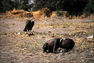
Although this photo by Kevin Carter is so sad, it is one that attracts my eye.  First of all the fact that none of the major subjects in this picture intersect adds to the photo.  Also there are multiple layers with the small boy in the foregrounds.  This photo evokes so much emotion, specifically horrifying and sad.  In addition to the previous elements I mentioned, rule of thirds is also used in this picture.

Photographs I like #3

This photo of the Afghan girl is not only one of the most famous photographs ever, but one of my favorites as well.  Taken by Steve Mccurry, this photo is very simple yet evokes so much emotion.  One aspect I like are how vivid the girls eyes are.  It's as if she is telling a story with them.  Her expression reveals so much about her life.  Also, I like that Mccurry was able to make such a simple portrait so complex.

Photographs I like #2

This photograph was taken by Ansel Adams.  The elements in this picture that attract my eye are the contrast, the leading line and the intensity that the dodging and burning adds.  The clouds add emotion to this photo while the mountain underneath them are intense in contrast.  The river also contrasts the mountains and trees, really making it pop.

Photographs I like #1

This photograph really interests me because it is underwater.  I like the lines, along with the ancient feel to this photograph.  The picture is of the Titanic, and extraordinary technology was used to take the picture.  I like that the subject is highlighted by light while the rest of the photo is dark.  It adds emphasis to the subject.

Digital 8 Critique


Secondary Visual Arts Performance Task


Critique of ______Digital Roll 8- Blue Toning___________________________


(Copy this organizer to take notes)

Art Vocabulary and Craftsmanship
The assignment for this photo was blue toning.  I slightly dodged the top half of the picture.


Elements
·          Color
·          Line
·          Shape
·          Texture
·          Form
·          Value
·          Space
There are leading lines in this photograph with the stairs.  In addition, there are lines with the railing, and horizontal lines on the stairs.
Principles
·          Proportion
·          Variety
·          Balance
·          Contrast
·          Pattern/Repetition
·          Rhythm/Movement
·          Unity/Harmony
·          Emphasis
Conceptual Skill
This photograph has a mysterious feel to it because you don’t know where the lines lead to.
Critique

I am somewhat happy with this photograph.  I wish the stairs weren’t dead center, and I could’ve added another element.

Other (Specify)
·         ?


Digital 10 Critique


Secondary Visual Arts Performance Task


Critique of ______Digital Roll 10- Studio Flash___________________________


(Copy this organizer to take notes)

Art Vocabulary and Craftsmanship
On this photo, I used a lot of dodging and burning on photoshop.  I burned the table to make the pencils stand out more.  I also slightly burned the light blue pencil.


Elements
·          Color
·          Line
·          Shape
·          Texture
·          Form
·          Value
·          Space
The lines on the table in this picture are somewhat leading.  In addition, there are lines because of the pencils.
Principles
·          Proportion
·          Variety
·          Balance
·          Contrast
·          Pattern/Repetition
·          Rhythm/Movement
·          Unity/Harmony
·          Emphasis
Conceptual Skill
This photograph has a fun feel to it.  Because of the colors of the pencils, it reminds me of childhood fun.
Critique

I am happy with this photograph.  I wasn’t at first until I dodged and burned it.  I would’ve liked for the light blue pencil to be slightly darker in the back, but it really stands out the way it is.

Other (Specify)
·         ?


Digital 9 Critique


Secondary Visual Arts Performance Task


Critique of ______Digital Roll 9- Split Toning___________________________


(Copy this organizer to take notes)

Art Vocabulary and Craftsmanship
To edit this photo we used split toning, highlighting the blue tones and yellow/brown tones. 


Elements
·          Color
·          Line
·          Shape
·          Texture
·          Form
·          Value
·          Space
The lines in this photo are nice with the steps.  Also, the reflection of the trees on the water looks nice.
Principles
·          Proportion
·          Variety
·          Balance
·          Contrast
·          Pattern/Repetition
·          Rhythm/Movement
·          Unity/Harmony
·          Emphasis
Conceptual Skill
This photograph evokes a very calm mood due to the calm water.  Also there is a warm feel due to the accented yellow tones.
Critique

I am happy with this photograph.  I feel like I could have added an extra element in the bare area of the water.


Other (Specify)
·         ?