5 Ideas:
~Motion blur
~Depth of Field
~Lines
~Creative Lighting
~Using hands and feet.
Favorite Photographer:
~Nick Nochols
Wednesday, January 12, 2011
Monday, January 10, 2011
My positive/negative
I am happy with this because of how the hoop poles match up. I wouldn't want to change anything about this photo.
Sunday, January 9, 2011
Lighting Notes
To understand exposure, you need to accept that overexposing and underexposing are key elements when it comes to lighting in photography. There are different situations that require you to overexpose or underexpose. You should overexpose a photo if what you are shooting is dark in comparison to the background, you are shooting in snow, and if you're subject is in shadow in a bright area. You should underexpose if you're subject is light compared to the background, and to create a sillhoutte.
My Portraits
Portraits

I like how your eyes are automatically drawn to hers.

I like that the woman is looking away from the camera. Also, the use of the umbrella was creative.

To be honest, I think the expression of this baby's face is priceless.

I like the playful feel of this portrait.

I like how you can tell a lot about this woman by the use of a prop(the drumsticks) in this photo.

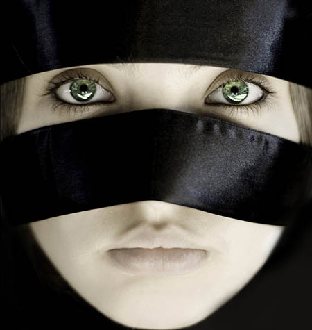
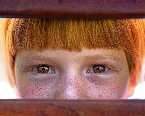
I like how her eyes are framed and the fact that they stand out.

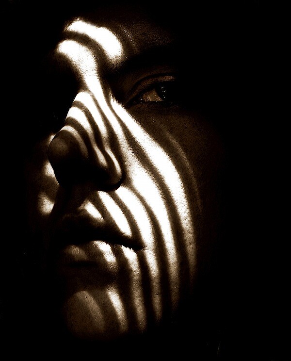
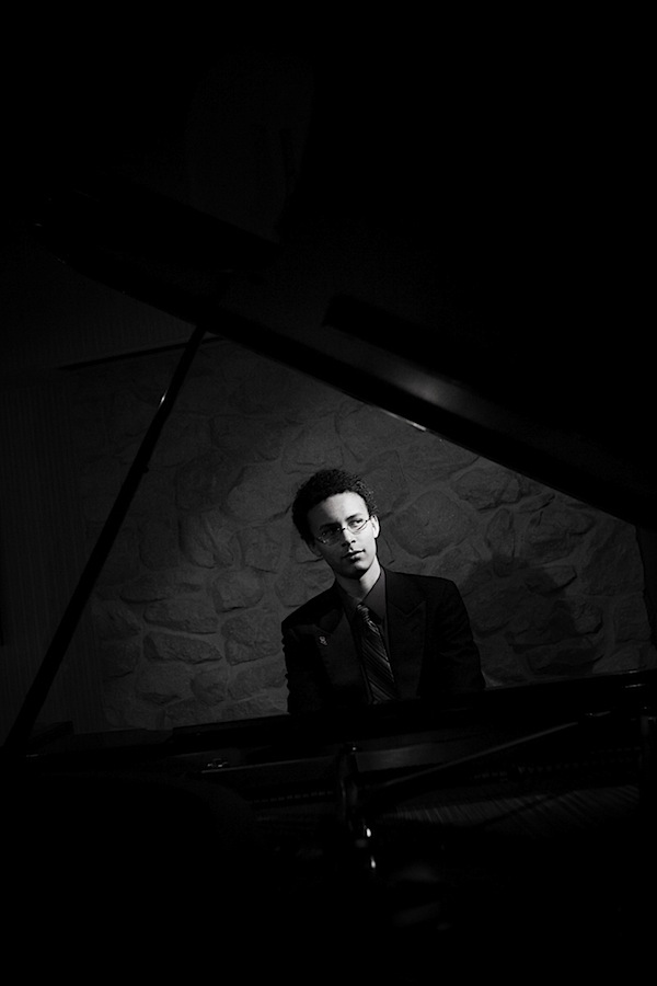
I really like the lighting in this portrait.

I think the baby in this picture looks very adorable.

I also love the lighting in this picture.

I like how the kids face is framed.
What makes a great portrait
In my opinion, there are multiple ways that could make a portrait stand out. One big way is to make the person's eyes really "pop". Also, you could use different lighting techniques to add a creative feel to the photo.
My Framing
Framing

I was attracted to this because of the lighting of the framed subject.

I like this photo because of how the mountain was naturally framed by the trees.

I like that they took a picture of a camera framing a frog. It was an interesting idea.

My eye was automatically drawn to the lady in the center of the picture because of the way the people in the foreground were positioned.

I like this picture because the couple is being framed as they walk the other way.
Subscribe to:
Comments (Atom)


